WEB APP, system design, B2B
Revamp and scale enterprise B2B healthcare solution

🔵 Context
PrecisePK couldn’t support varied hospital protocols, causing workflow friction and repeated customization asks. As the solo designer in the team, I created 1 unified solution to meet 2 stakeholder goals:
Hospital pharmacists, who need to match their protocol workflow for safe, confident dosing.
PrecisePK, who wants a scalable way to support customization without bespoke builds for every client.
✅ Solution
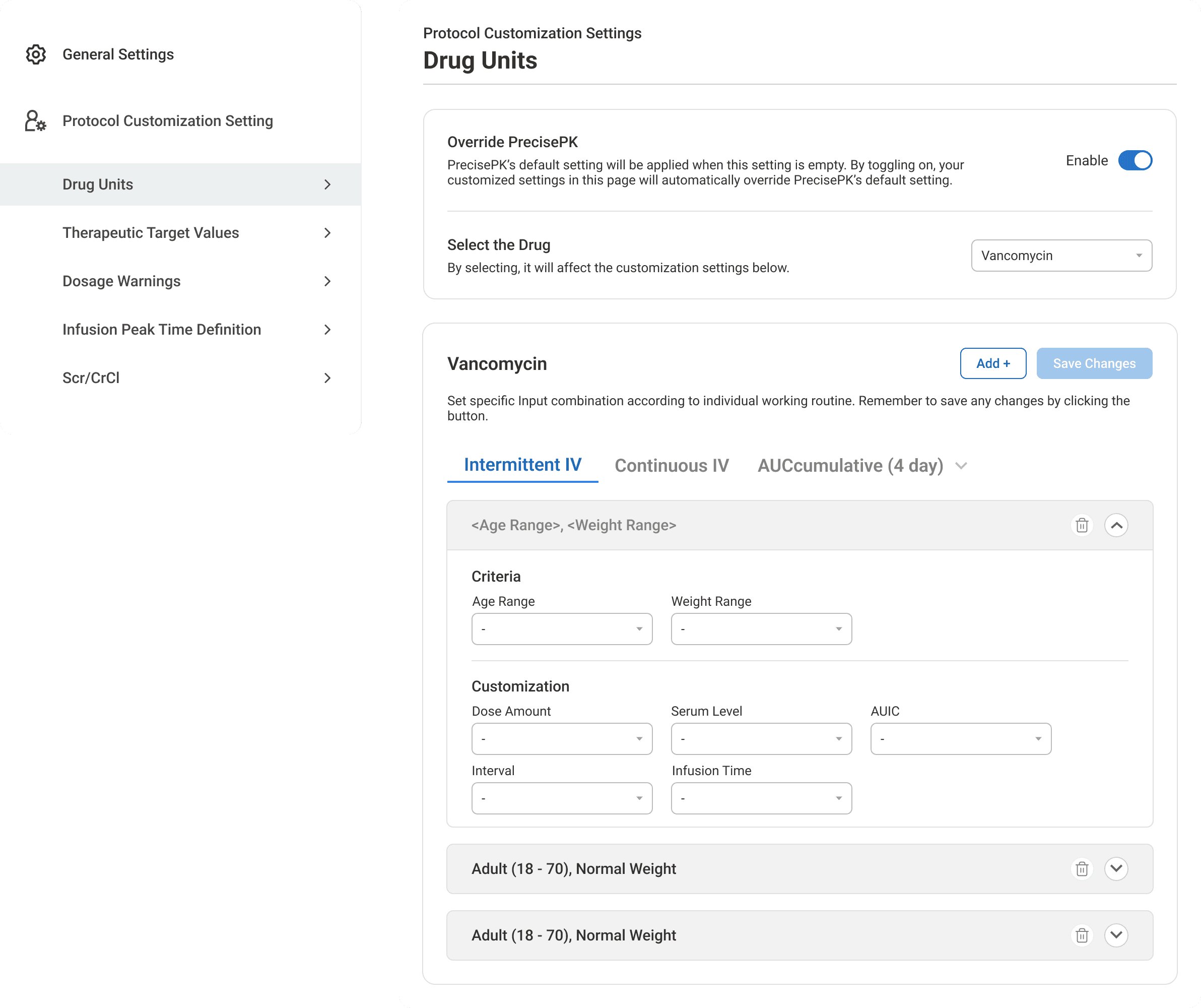
A Protocol Customization Setting that lets hospitals configure protocol behaviors in-product with a guided setup flow.
🚀 Impact
Productized 20+ client requests into a repeatable system.
Improved enterprise fit and reduced manual, one-off customization work.
Supported adoption at 200+ major hospitals ( (UCSF, Northwell, UCSD, etc..)

The Goal
System Setting Page experience has been complained by our users, the pharmacists, for years…

Previous Setting Page: rigid with limited options
So, I was assigned the project:
Redesign the settings experience of PrecisePK to improve pharmacists’ workflow and maintain the retention.
Challenge 01
How did I overcome the unfamiliar domain?
When I started looking into the details of this project, terms like these came across — I got stuck at the very beginning.

I built that foundation by reading dozens of dosing reference papers, and luckily at the time ChatGPT just came out, I was able to use it to clarify terminology and logic as I learned.


Challenge 02
Massive of emails and tickets, where should I start?
I went through them one by one and rewrote them as user stories as below — basically imagining myself as the pharmacist in their daily workflow, to understand why each issue mattered.

Then I sorted the user stories by how often each issue came up — the more frequently it appeared, the higher priority it became. I grouped everything into five core problem areas, clarified what I needed to tackle in the new design.

Challenge 03
How did I validate my understanding and my direction?
I was the only designer in the team, and there was not even a product manager. As a result, I had to take the initiative:
Met with in-house pharmacists for many times
Created early-wireframes to share
Hosted a kickoff meeting with the team to align everyone on both the problem & direction


all the mix of self-study and conversations helped me bridge the knowledge gap and build the confidence to design for such a critical and complicated workflow. I realized:

Finding 01
Hospitals follow different dosing guidelines.
One of the first things I uncovered was that dosing isn’t standardized at all. Even for the same drug, different hospitals follow different clinical guidelines.
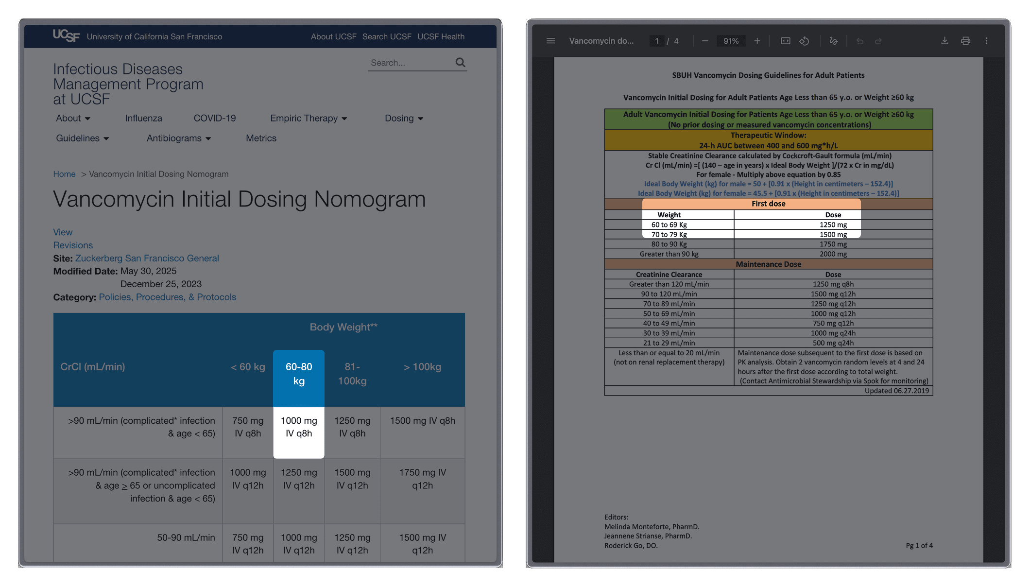
Dosing Guideline of UCSF and Stony Brook University Hospital.
Finding 02
Different drugs have specific criteria.
And beyond institutional differences, each drug itself has unique clinical criteria.

Finding 03
Pharmacists can’t think about settings mid-care.
From the user perspective, Pharmacists cannot stop in the middle of treating patients to think about system settings. In one of the email we received from pharmacist, he said....

Research Synthesis
Our tool treated dosing as one-size-fits-all,
while pharmacists lived in a world of nuance and variability.
refined goal
How can I make the system flexible enough for every hospital,
but still easy and safe for pharmacists to use?
mental model
The mental model of the new setting page was built around pharmacist's journey: starting with choosing the settings, setting up the high-level rules, and ending with creating customized cases.
By grounding the design in this linear but flexible flow, I was able to give users a clear sense of way to complete their particular needs while keeping the complexity of various information intuitive.

The Layout
Following users' mental model, the setting page carried various types of information and inputs, and I want to create a journey that pharmacists only stay at one static screen without any extra popup window jumping. I end up making it to be a continuous, 3-step journey.

The structure and flow you see now may look obvious/simple, but it really took what felt like a thousand iterations to get there.




The impact
This feature has been deployed and is actively used by pharmacists in over 200 major hospitals, including UCSF, UCSD, and so on.

🕺 Jump out of my comfort zone & Seek for help ;))
Product Design in healthcare is a challenging yet satisfying job! I love diving deep into research to gain insights about the industry and product users, and solving multi-latitude complex issues for them. I had to jump out of my comfort zone. I asked a lot of questions, talked to pharmacists, and gathered the team together. And that actually made my work so much stronger.
🧠 Design with systems thinking to balance complexity with clarity
Designing for this B2B healthcare product provided me with the opportunity to make sense of incredibly complex problems. Pharmacists’ workflows are complex and interconnected, and they’re under pressure. So I learned to design not just the interface, but the entire experience across touch points, grounding decisions in empathy and clarity, not just UI patterns.
🌊 Aligning users' goals and business goals is a dynamic process
This helped me realize the weight of my job - advocating for the users within the business and helping the business bring more value to the users. The bridging role of product design is super empowering and exciting!